


Helping Hands
Helping Hands
4 weeks
Figma
AfterEffects
User Interface
Helping Hands is about creating a platform that will make it efficient for users to volunteer in their local area without having to constantly search for opportunities online or worry about limitations such as age, skills, or accessibility. Helping Hands makes the volunteering process easier, allowing users to “volunteer anywhere, anytime, with anyone”.
Overview
A multidisciplinary designer that enjoys making people happy in any way possible.
Timeline
Tools
Category
Let’s update this old design!
Create an attention-grabbing design that elevates the way user’s view their ID’s. Help users feel comfortable and excited to show off their ID’s as it not only shows who they are but also where they are from in a fun way.
Make it accessible for everyone!
Create a clear visual hierarchy that will help users and viewers easily scan through the information. Play around with font sizing and keep in mind color accessibility.
Research
The next part of the process is to do a competitive analysis on current digital platforms that help users enroll in volunteering activities and programs.
While the platforms I analyzed had great features that I took note of to incorporate in my design, there were many flaws such as outdated interfaces, registration limitations - meaning user can only enroll if they are part of an organization, and offering volunteer opportunities catered only towards a specific audience.
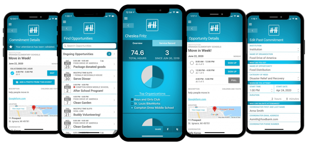
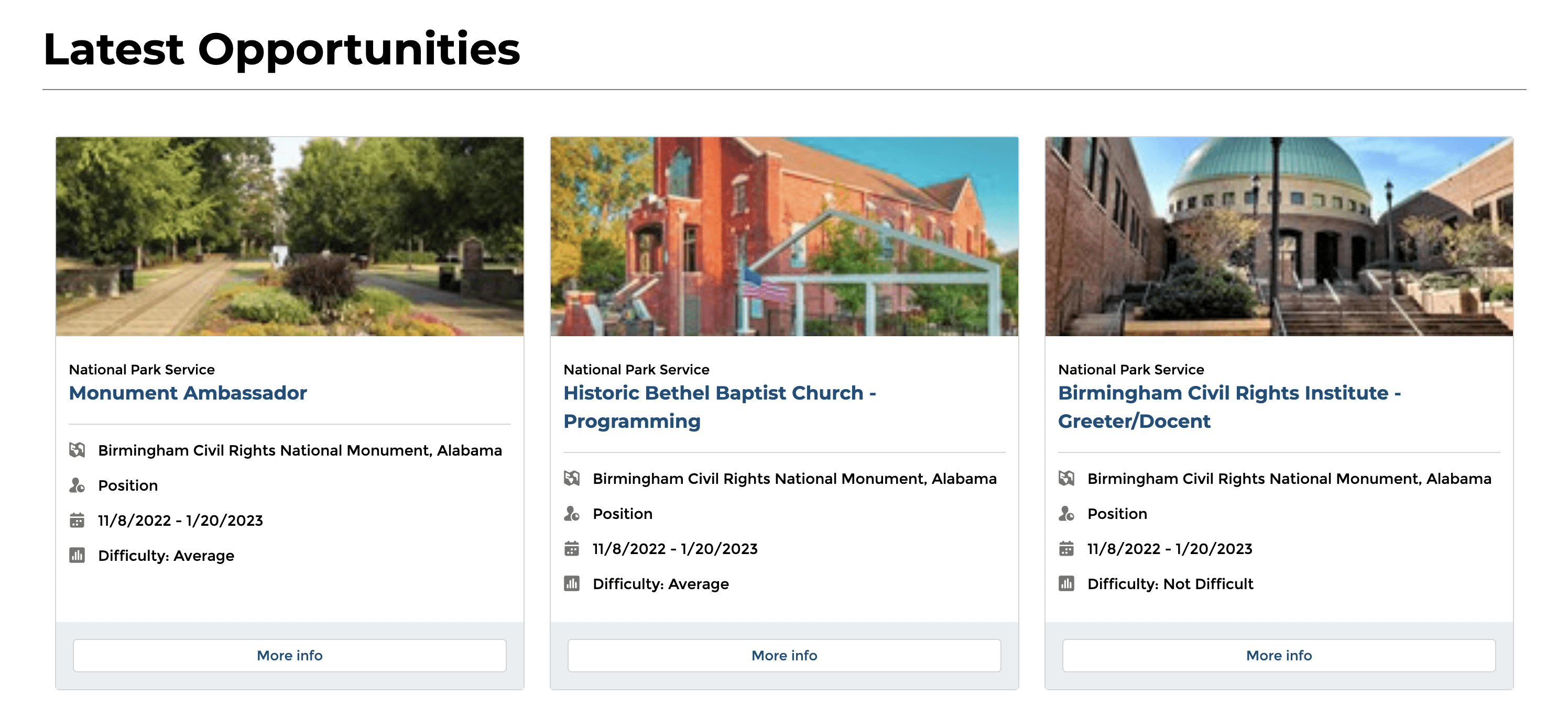
Competitive Analysis
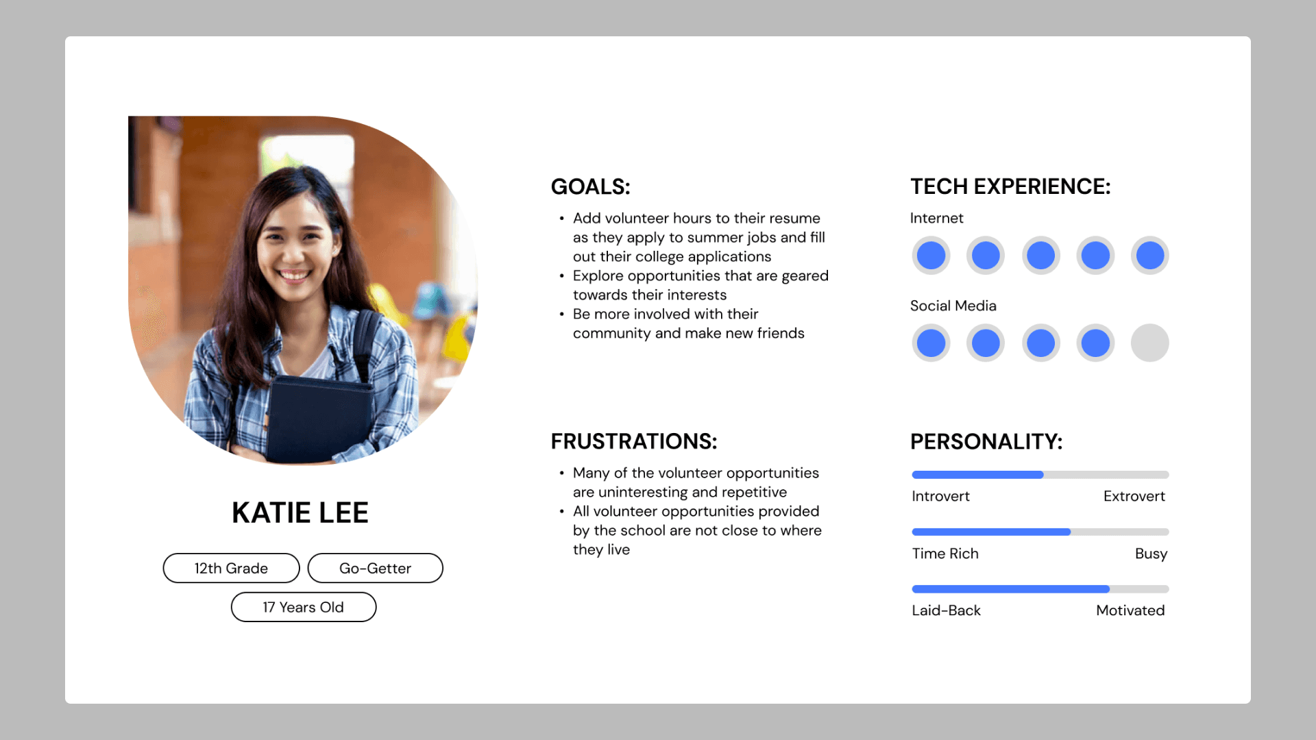
The next part of research is to understand my target audience and dive deeper into who they are and why they would benefit from using my product.
Along with the user persona, I created their possible journey of how they would utilize my product from start to end.
User Persona & Journey
Goals
Prototype
Conclusion
At the end, I really enjoyed working on this project and learning more about user interface and improving the user experience. I had a very strong start, having a general idea of what I wanted my product to look like. But as I continued to experiment with different layouts and designs, I would constantly ask myself “how can I make this easier?” for the user. I’d find and research ways other applications implemented the same or similar functions I wanted to include
A few important things I learned from this project were:
Takeaways
Research is important!
Push the experimentation process.
When you design anything, it’s important to have a strong foundation and understanding of the purpose of the project. Research and analysis has allowed me to know about current design solutions to certain functions and experiment!
If were to do something different throughout my design process, I would experiment with more iterations and further build the product brand. I knew I wanted to focus on functionality more than aesthetics and while I do enjoy the brand I created, I would continue to explore other ideas.
video is missing i know sorry :(
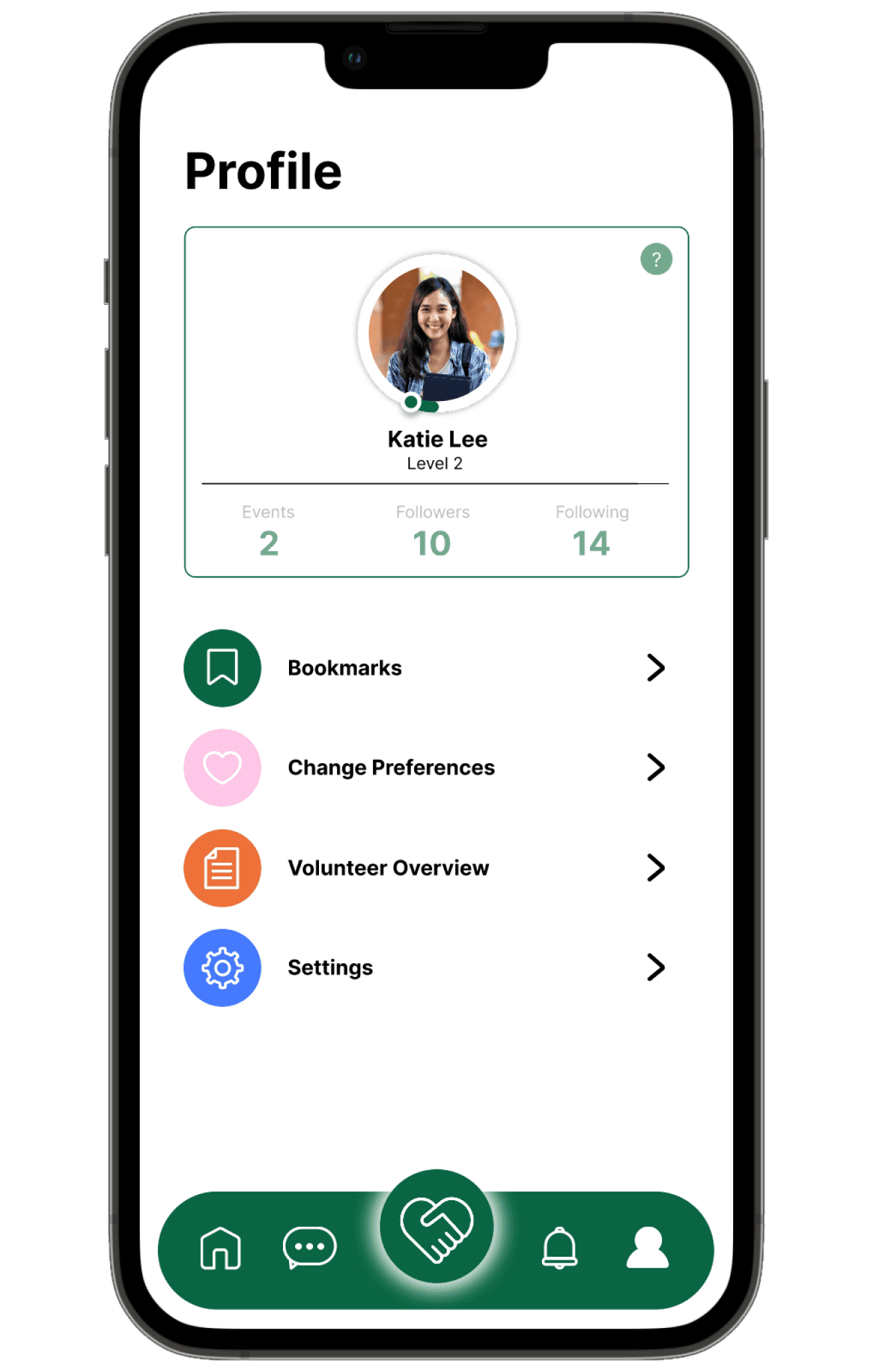
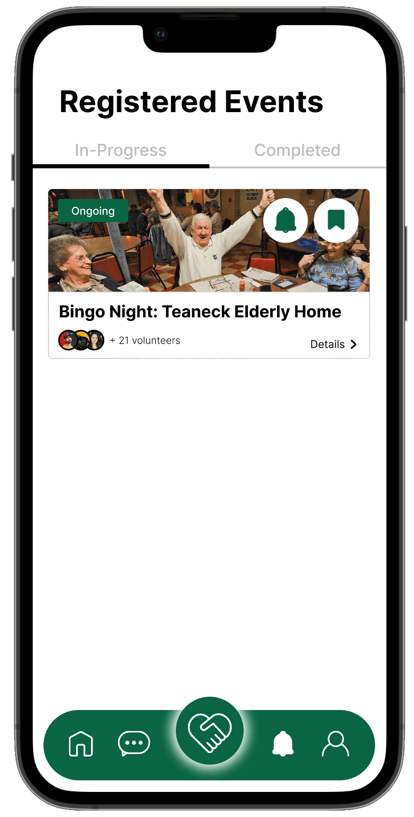
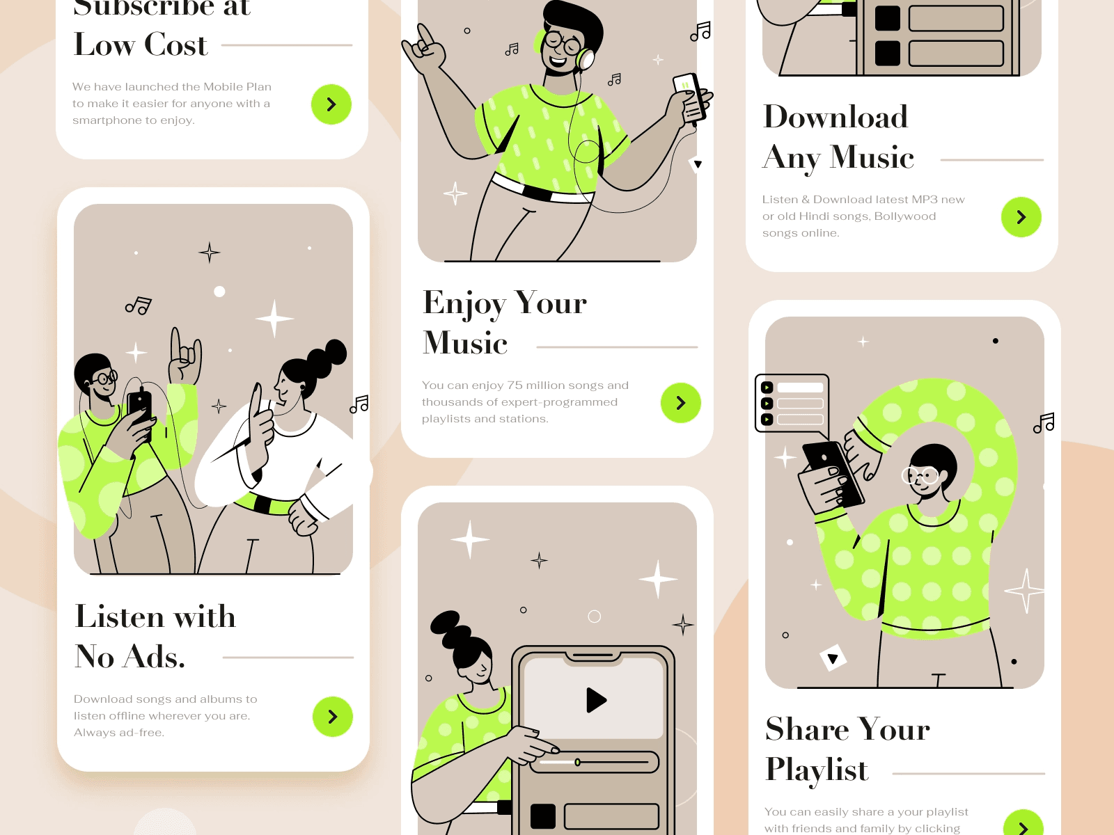
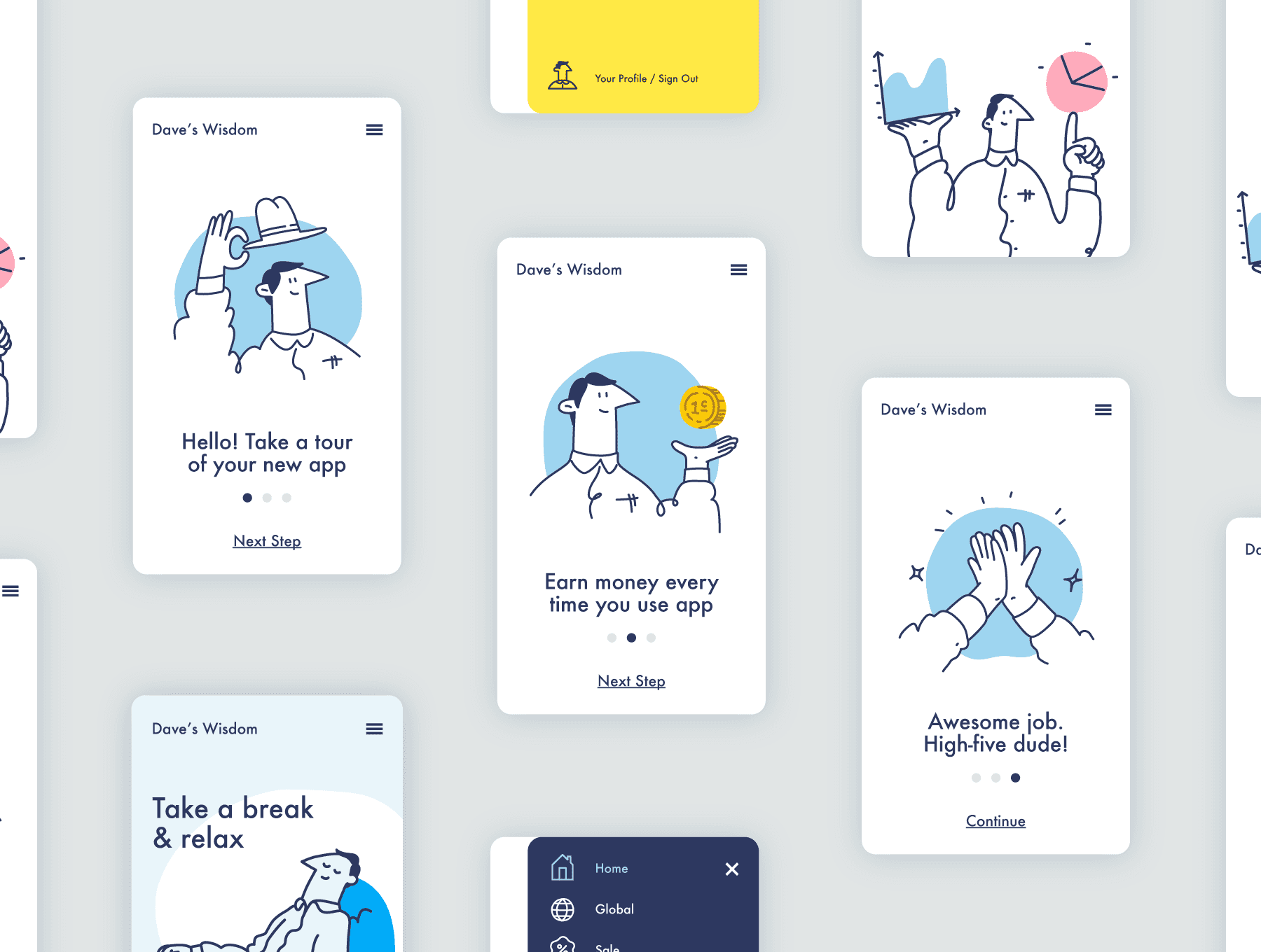
Final Designs
View Full Process Deck

When trying to decide the direction and style of my project, I knew that I wanted to incorporate graphics and colors that would not be too distracting because I did not want it to take away from the main purpose of using the product. Each page the user would explore would contain important, textual information. I explored two directions that were opposite of each other, one inspired by lines and the use of white space and the other focused on geometric, dark, opaque shapes.
Inspiration & Direction
Direction 2
Direction 1


Work
Play
© 2024 Bea Chin