
New York State Digital ID
New York State Digital ID
5 weeks
Figma
AfterEffects
Branding
User Interface
User Experience
The main goal of this project is to make a digital driver’s license that represent a physical card. Aside from displaying the required information needed in a driver’s license, another goal of this project is to create a fun user experience that incorporates elements that reflect the state the user is from and focuses on providing accessibility and privacy in a way that users can easily connect with and rely on.
Overview
A multidisciplinary designer that enjoys making people happy in any way possible.
Timeline
Tools
Category


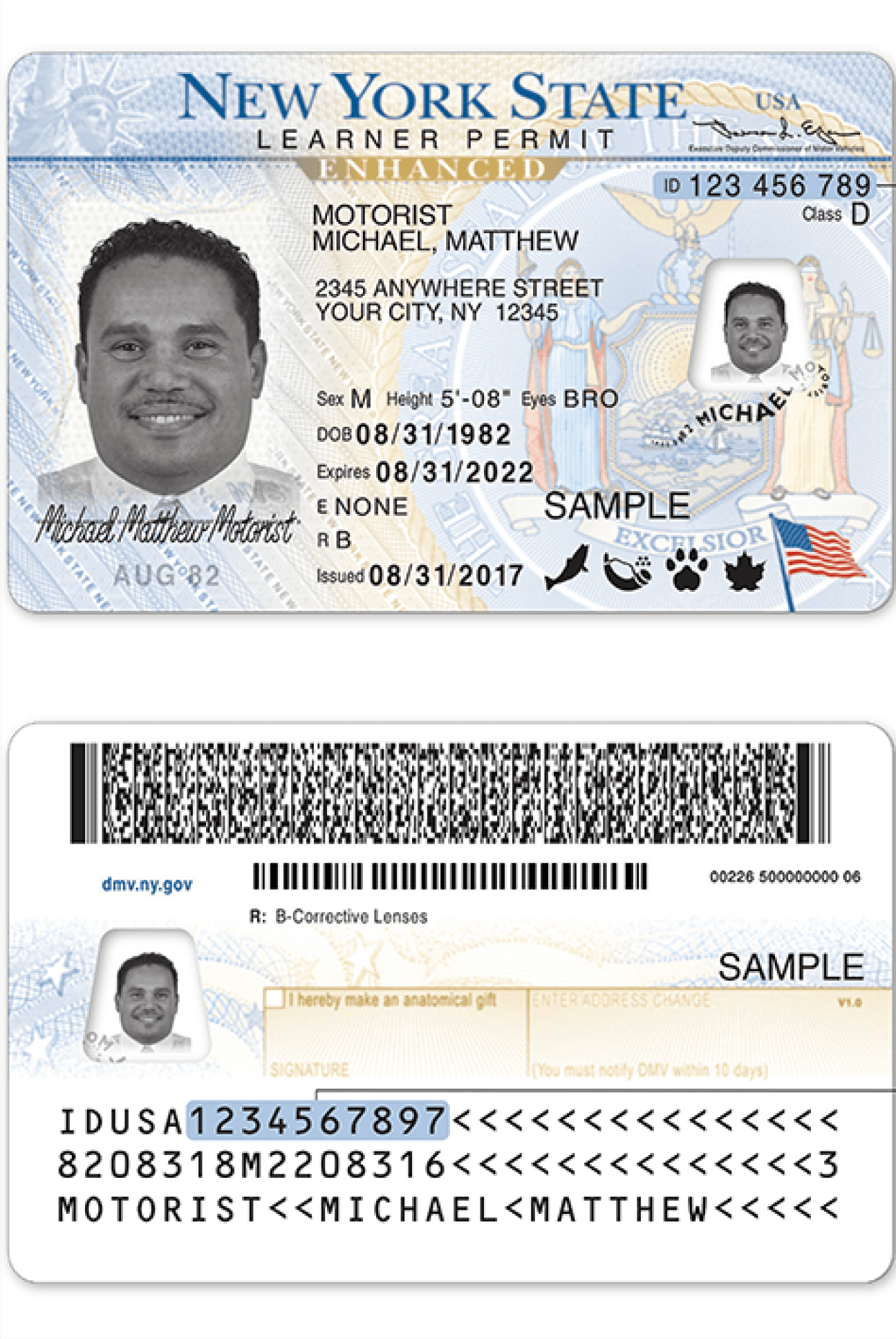
Research began with doing an analysis of what the current New York State License looks like. This can help us understand what information is important to highlight and what is not.
Physical ID Analysis
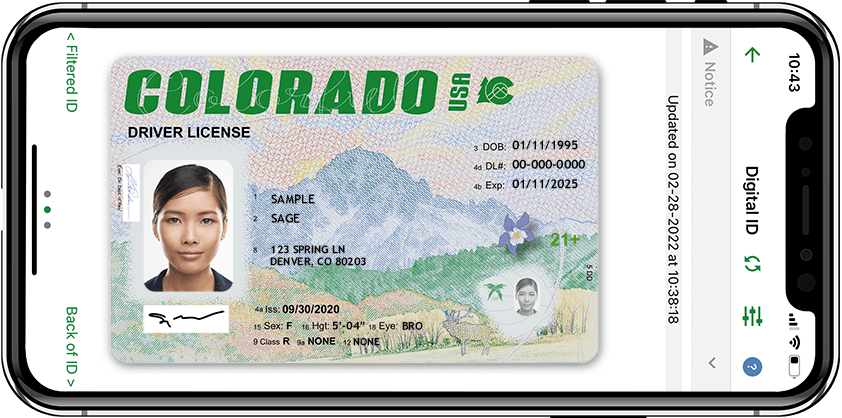
The next part of the process is to do a competitive analysis on current digital platforms that allow users to view their licenses. There are only a handful of states that accept digital identification and when comparing them, they share similar strengths and weaknesses.
While they display the necessary information that a physical ID has, they lack in design. They missed the opportunity to go beyond just a photo scan of a user’s ID and create an experience that builds a connection between the user and their state.
Competitive Analysis
I went through a loooooong process trying to figure out what direction I wanted the project to look like. I decided to explored two directions that were different from each other and created multiple iterations. I was heavily inspired by the New York Subway/Metro and well-known iconography associated with the state.
Inspiration & Direction
Direction 2
So many icons and there are no indicators or title to describe what they mean
Users often forget to sign the back. If their signature is already in the front why does this matter?
Why do users need to see this information? Also if the ID is stated in the front, why is it repeated in the back?
Another patriotic background design. Much better than the front, but is not appealing.
Boring background design of the state flag. Feels too American and patriotic. Also makes the information on top feel cluttered and unclear. Can affect a user’s readability.
Extremely obvious indicator of New York, but what if a New York resident hasn’t even seen the Statue of Liberty?
Why is the information separated in such a weird way? Why is the spacing inconsistent?
Unflattering image design with feathered border
Weird diagonal graphic element that just says ‘New York State’ repeatedly?
User’s signature is limited to a small area. This results in the signature being extremely distorted as it has to be resized.
What is the significance of this date?


Research
Goals
Prototype


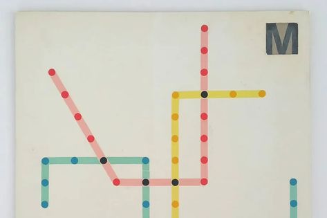


Direction 1
Conclusion
Overall, I learned so much through this project. In the beginning, I felt really confident that I would be able to create an engaging design that doesn’t take away from the functionality and purpose of the application. However as I started to work on it, I encountered many obstacles. Despite the obstacles, I’m satisfied with the final outcome of the digital driver’s license!
A few important things I learned from this project were:
Takeaways
Don’t stop experimenting! Iterate!
It’s okay to feel lost.
It’s important to make various iterations even if the changes may be small. Each change can help create something even better and is one step closer to the final design.
It’s important to reach out to those around you who can help shine a new light and provide a new perspective on your progress. Whether it’s a creative block or a design trap, there’s always a way out of it.
Have fun!
This can be extremely forgotten as a project may seem like a task you just have to complete. By creating a design you love or enjoy, the more excited and motivated you are to make it. You also learn new things along the way that will influence your design for the rest of your life.
Final Designs
Leave the boring, ugly design behind!
Create an attention-grabbing design that elevates the way user’s view their ID’s. Help users feel comfortable and excited to show off their ID’s as it not only shows who they are but also where they are from in a fun way.
Give users control over their information!
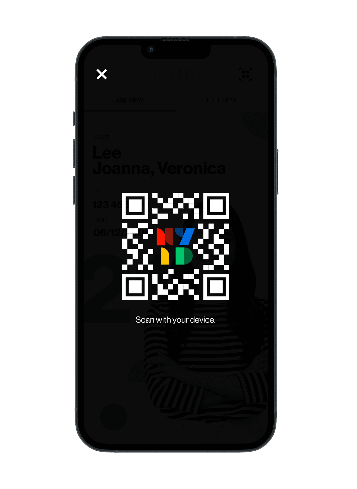
Create an age verification view along with the full license view, which allows users to choose what information they want to display.
Make it easy for everyone!
Create a clear visual hierarchy that will help users and viewers easily scan through the information. Play around with font sizing and keep in mind color accessibility.
View Full Process Deck
Work
Play
© 2024 Bea Chin