MabuhayAir
A redesigned airline booking experience built on variable prototyping and a comprehensive design system.
Design Systems
UX
UI
Web Design
Project Overview
Timeline: 14 weeks
Tools: Adobe Illustrator, Figma, Figma Variables
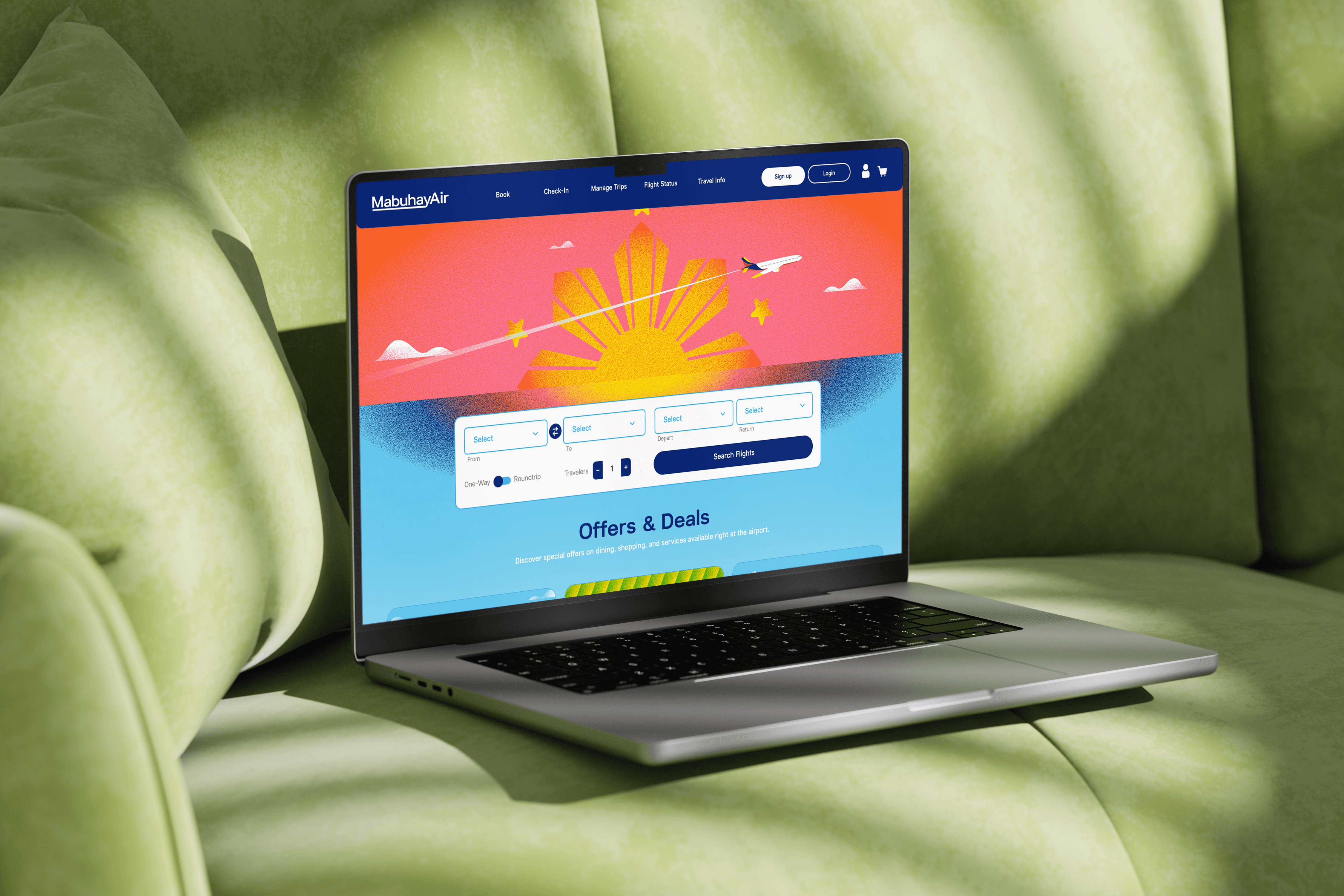
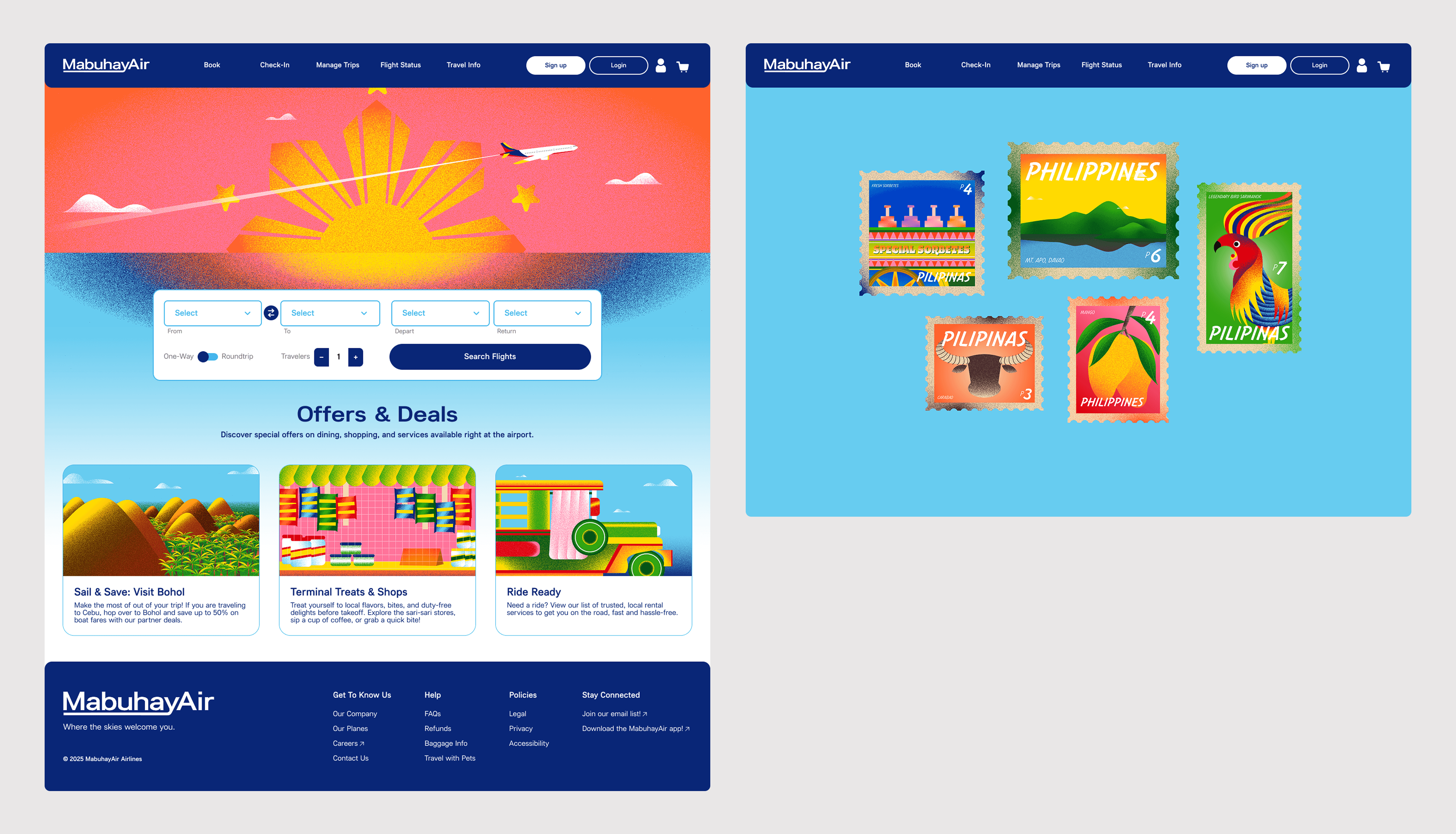
MabuhayAir is a fictional airline booking site for flights within The Philippines. The main goal of this project was to create a design system and prototype that utilizes Figma variables and properties. It focused on understanding and streamlining the user's journey as they navigate through the booking process.
Prototype
Coming soon!

MADS: MabuhayAir's Design System
Introduction
MADS stands for MabuhayAir's Design System and contains everything that makes up MabuhayAir. When designing the our airline and booking site, we wanted to share the vibrant and fun feeling that the Philippines has to offer. No matter where you go, there is a feeling of warmth and community that is shared. Our goal is for our customers to feel that they are never too far away from home and can travel with ease. Our design system incorporates these feelings and prioritizes efficiency and consistency as customers navigate our platform.
Please check out the link below to get an in-depth, comprehensive view of the design system!
Research & Planning
Competitive Analysis
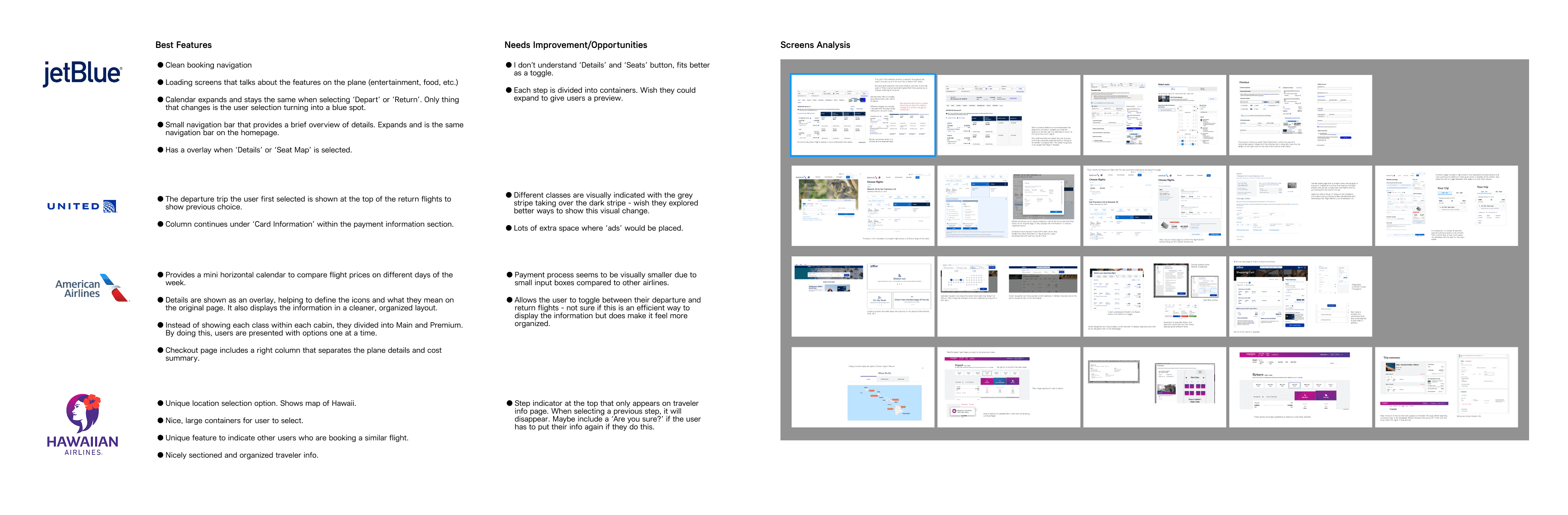
When studying airline booking sites, I researched a handful or airlines: American Airlines, Hawaiian Airlines, JetBlue, and United Airlines. I took apart each section of their booking process, from the homepage all the way up until you confirm your flight(s) and taking notes on key elements and special features that were unique to certain sites. I also looked into their visual identity, learning a bit about the history of each airline and how it came to be.
Creating the Flight Paths
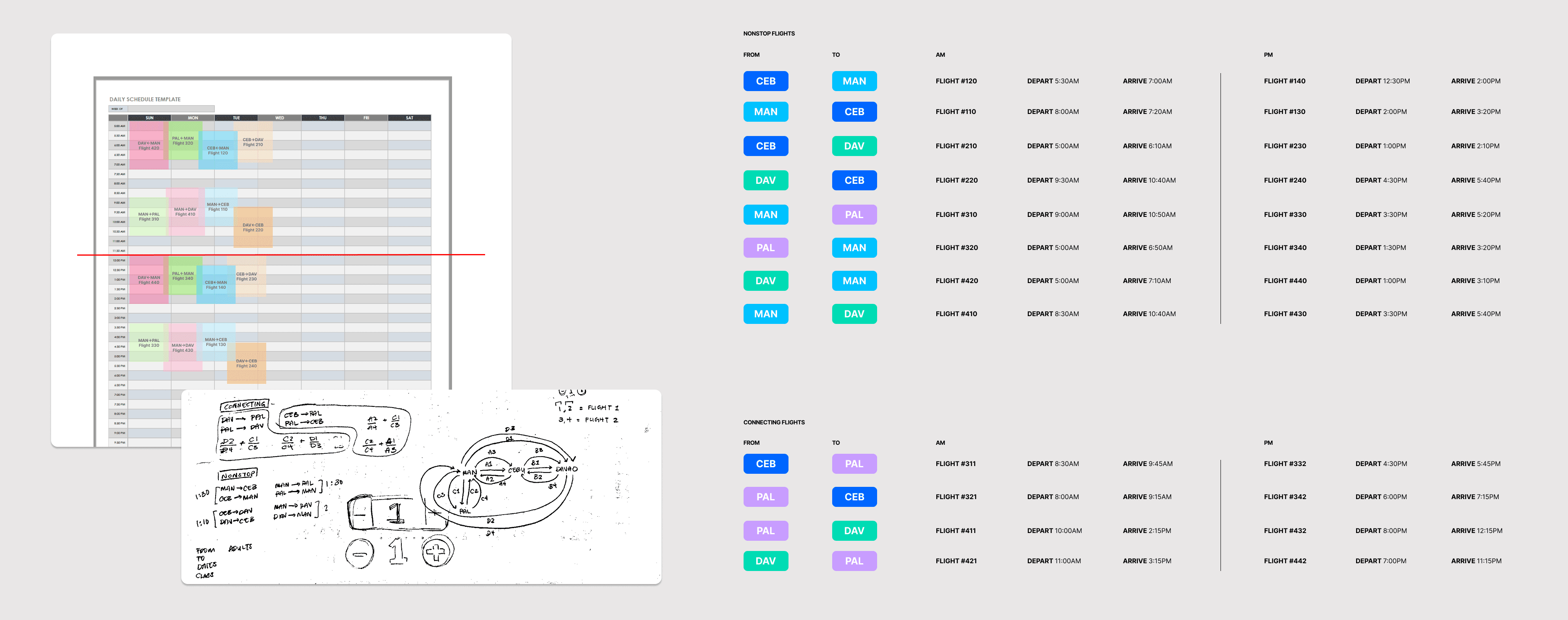
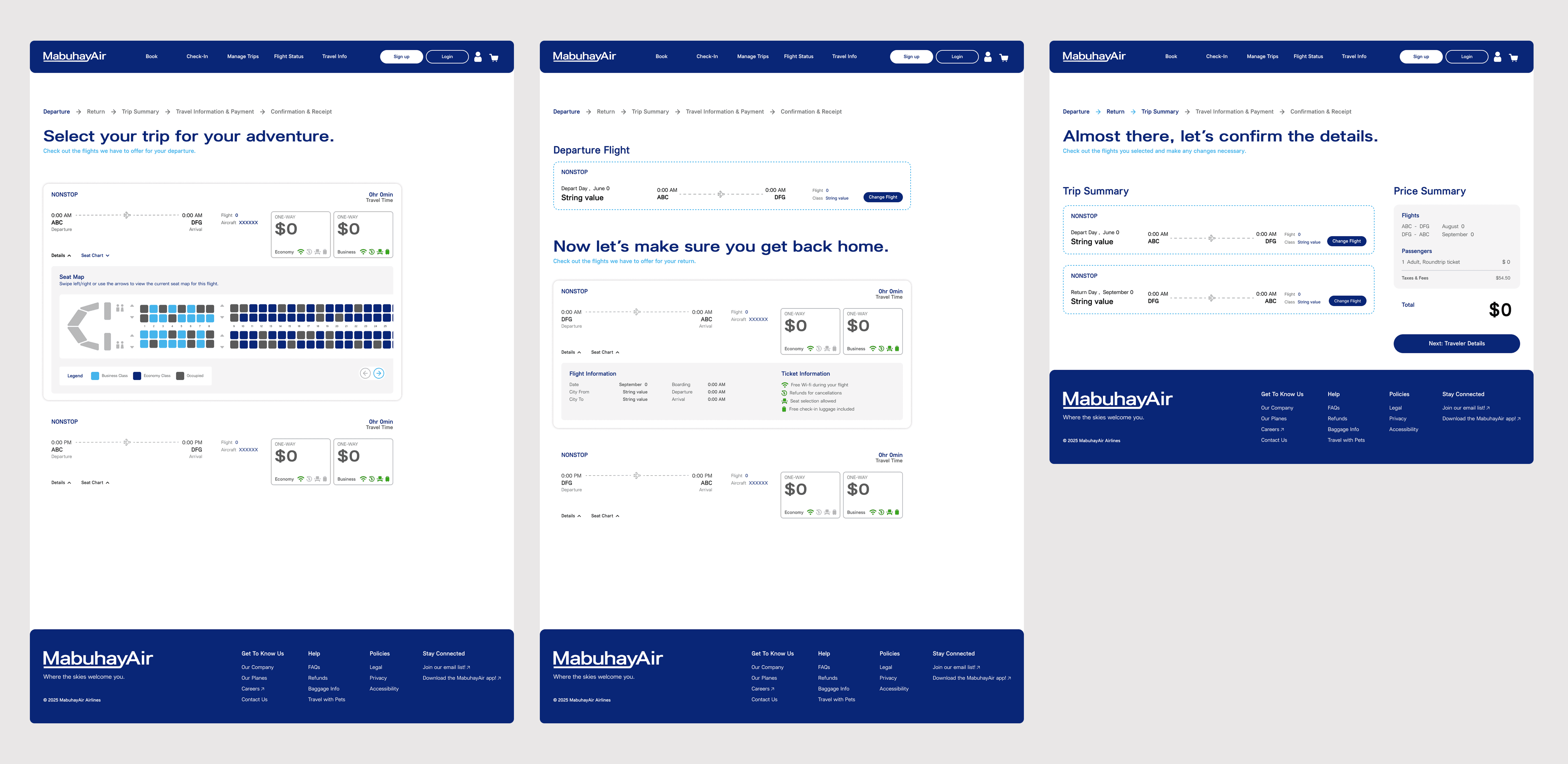
Organizing and planning out the flight paths were the longest part of the planning process. At first, I was a bit ambitious and thought I can create flights going to and from each place, including multiple layover options. However to work within my timelines, I narrowed it down to make it a bit easier.
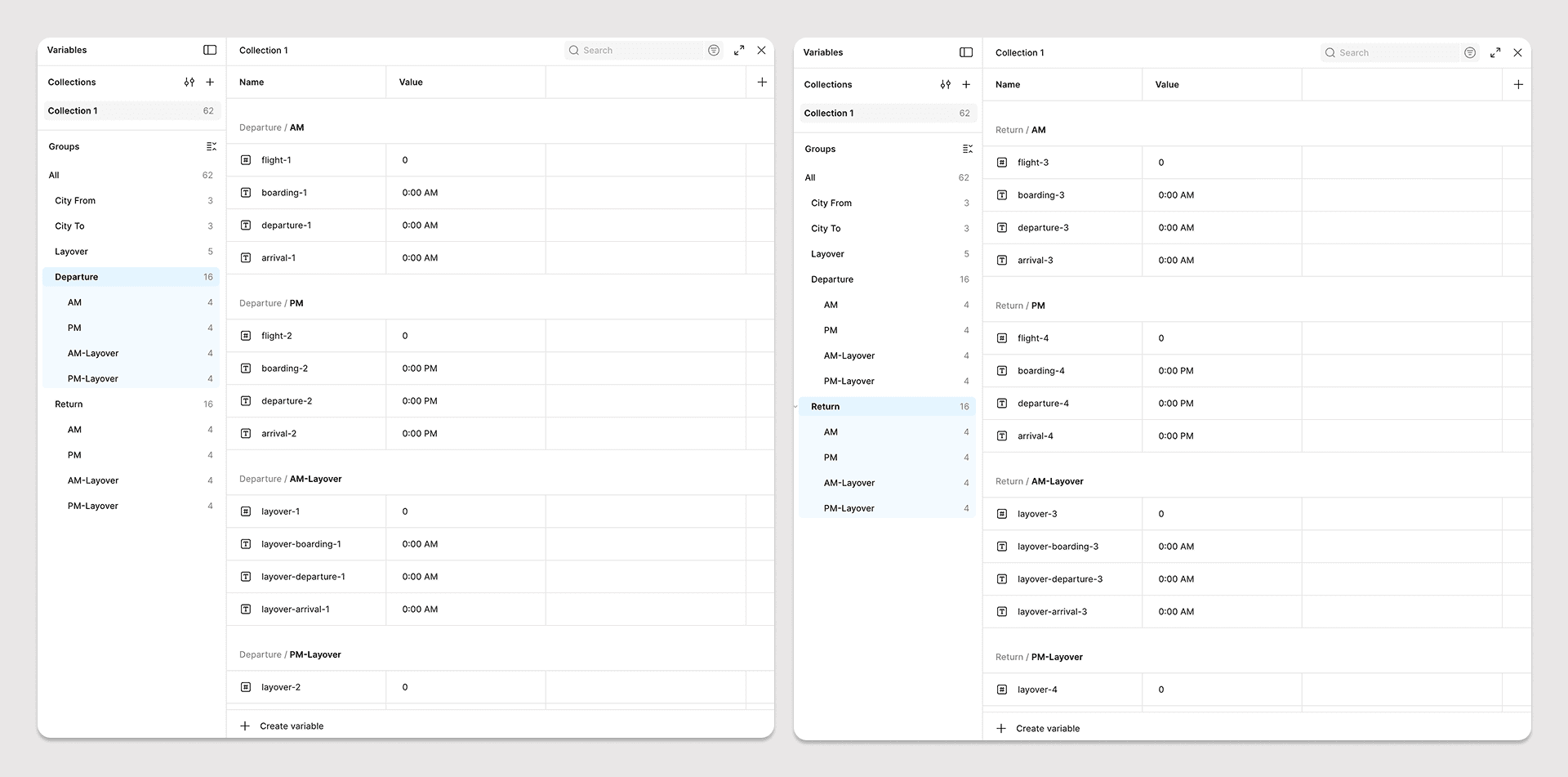
In total, there are 12 flight paths – 8 non-stop flights, 4 layover flights – each with an AM and PM option.
Figma Variables
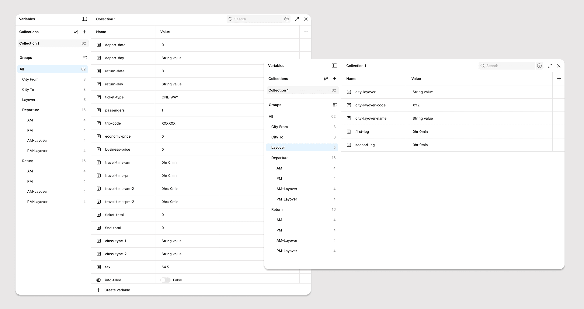
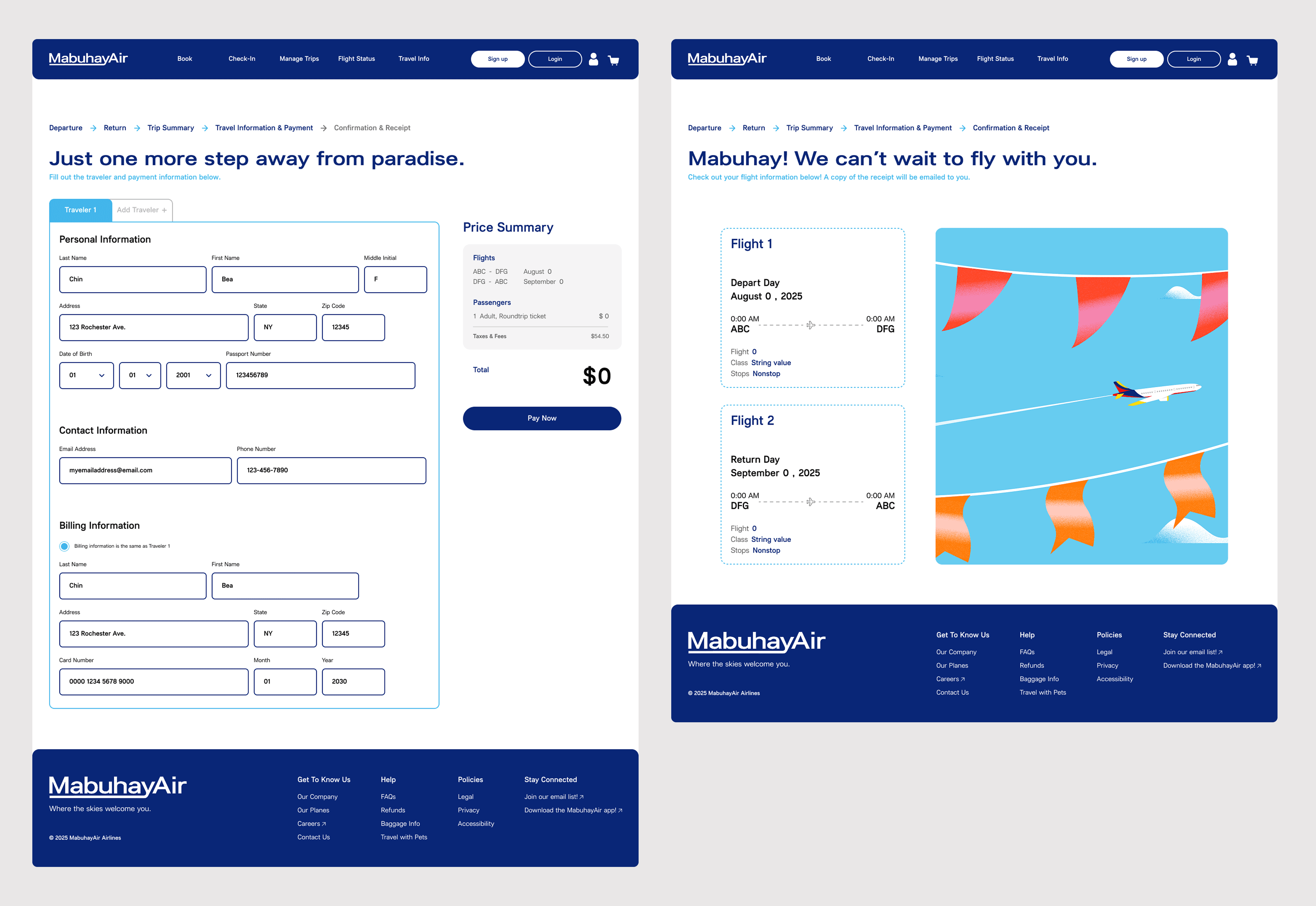
Part of the prototyping process was to utilize Figma Variables. After figuring out the flight paths, it was important to understand what information was needed on each screen and how each information will be used on the next screens. Specifically, it was important to make sure that the flight options displayed would reflect the user's inputs.
While Figma Variables enhances the prototyping process, it is also limited to how much information can be loaded depending on the action. So to work around this issue, variables were set based on actions like 'On Click' and 'After Delay' to provide a smooth prototype.
Visual Design
Inspiration
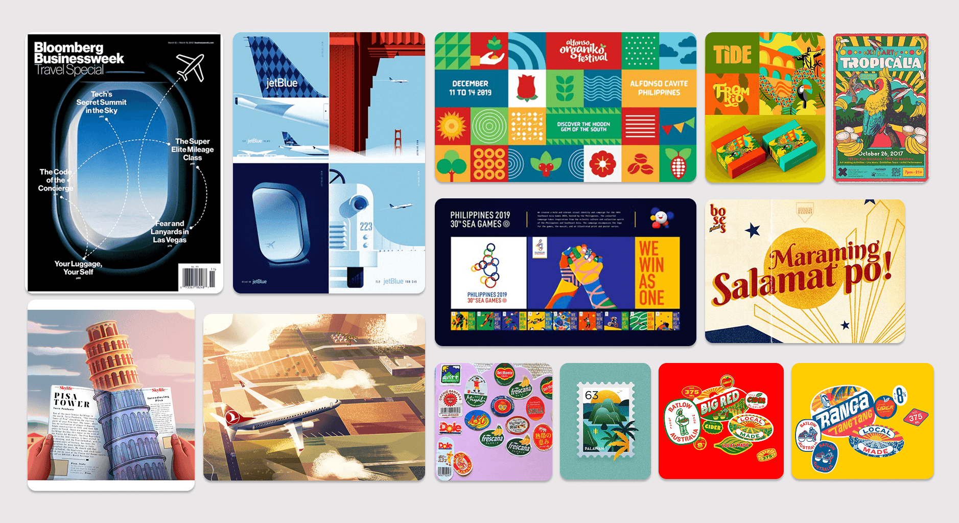
When it came to figuring out the visual design, I knew I wanted it to be full of color. The Philippines is a tropical country with wild animals, delicious fruits, and warm people. However, I knew I needed to find a balance between being playful and functionality, as I did not want to distract or lose focus on the main purpose of the site.
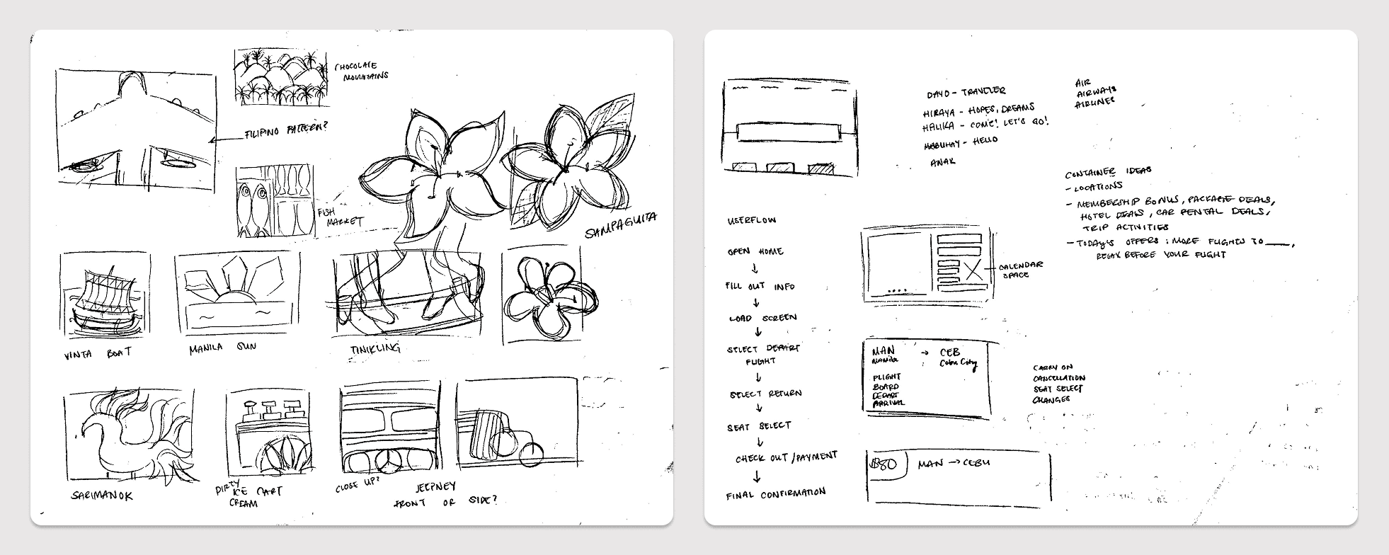
I was also inspired by previous airline marketing ads, such as jetBlue's illustrations by Lab Partners, Bloomberg's TravelSpecial cover, and elements and shapes that utilized gradients and textures.
Iterations
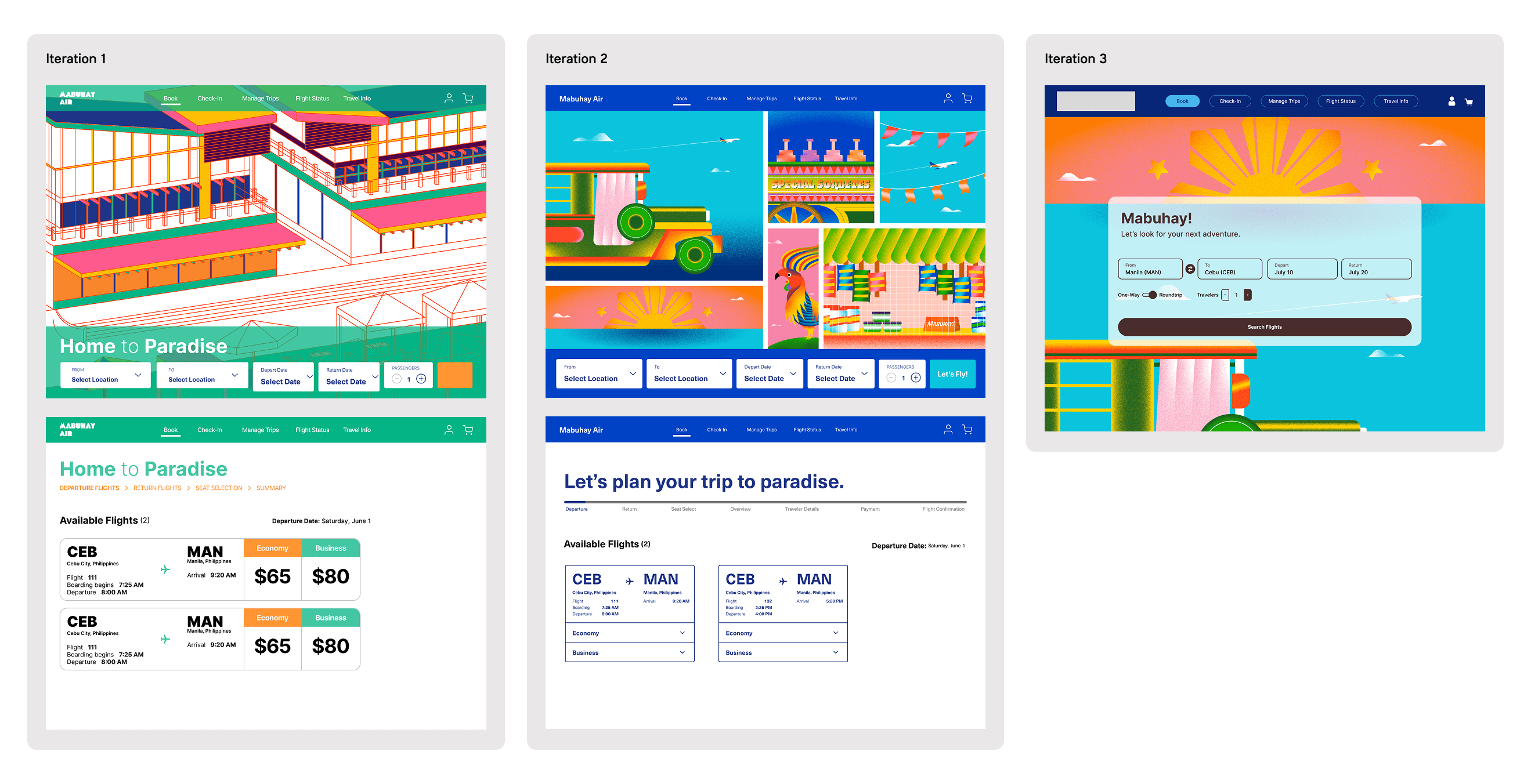
Final Designs
Takeaways
My biggest struggle throughout the project was finalizing the visual design. I realized I kept getting stuck on finding a way to incorporate color without being too distracting. A lot of the airlines I researched used a very simple color palette and minimal illustrations. With my personal experience of traveling to the Philippines (and being half-Filipino!), I wanted to channel the colorful and welcoming energy the beautiful country has to offer. Aside from enjoying the time I spent working on the illustrations, I also enjoyed utilizing the Figma variables and properties. With my prior knowledge of coding principles and utilizing conditionals, it made it easier to navigate and visualize how information is carried and read from one screen to another. Figma variables were the key to creating a complex design system that provides a seamless user, designer, and developer experience. While this was the longest and most challenging project for me as a designer, it has to be my favorite project that I am very proud of!
